Site Updates Vol. 10
A New Coat of Paint, a Command Palette, and Your Own Cellar (If You Ask Nicely)
By Boris
Last volume the site finally woke up. Accounts, signups, a ledger, a Telegram bot - a museum with a working front door. Ten days on, the museum has had a proper tidy. New typography, a command palette, a home for your own pages, producers laid out like a newspaper, and the quiet beginnings of something I'm not quite ready to announce yet.
This is less "look at all the new toys" and more "look, everything moved an inch to the left and suddenly the room breathes". Which, if I've done my job right, is exactly what you want a site like this to feel like.
A Proper Facelift
I spent a week with a fine-toothed comb and a stack of typography "books". The site now uses Literata throughout - a book serif designed for long reading - with a quieter sans face for chrome and tabular numerals everywhere a number wants to line up with the number below it. Contrast was bumped where it needed to be to actually pass WCAG AA instead of just pretending to.
The big change, though, is that the cards are gone. Or most of them. Those sloped, shadowed, rounded little tubs that every page was wrapped in? They were doing nothing except making the site look like a dashboard. They've been replaced by hairline rules and editorial air. Pages now have sections - real ones, separated by whitespace and a quiet horizontal line instead of boxed off with drop shadows like a stack of business cards.
The home page shows it best. The hero sits on its own. The next event gets the treatment you'd give a headline in a newspaper. Also coming up is a tight list, not a carousel of cards with fake depth. Recent tastings are a numbered list. From the archive is a two-column grid of post thumbnails that don't pretend to be physical objects.
Scroll a little further and the pinned post and archive look like, well, a pinned post and an archive. Not six indistinguishable rectangles screaming for your attention.
Posts got the same treatment. The eyebrow tells you what kind of post it is before you read the title. The body sits at a proper reading width. The table of contents is inside the prose, not floating in its own decorative frame.
None of this is new functionality. It's all the same pages doing the same things, just laid out like someone cared. Which, for what it's worth, I did.
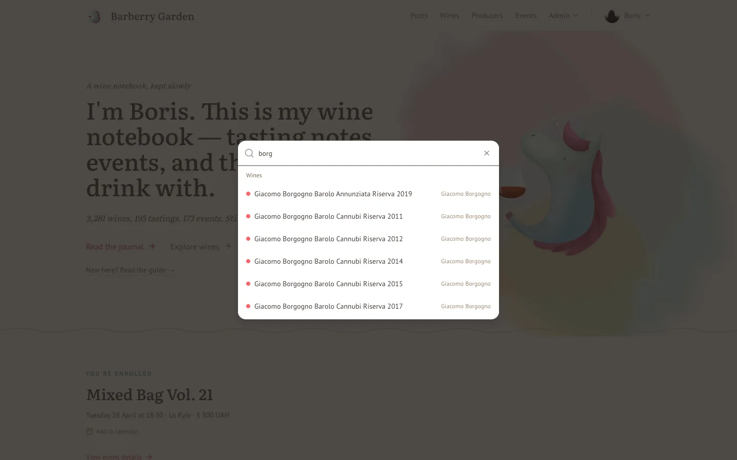
Go Anywhere: ⌘K
Press ⌘K (or Ctrl+K if you're on the alternative operating system) from anywhere on the site. A command palette opens. Start typing and it searches across wines, producers, pages, and your own bits - profile, cellar, ledger. Hit Enter and you're there.
It's small. It's also the feature I now use more than any other. If you find yourself reaching for the URL bar, try this first.
Your Profile Has Moved In
For a long time your personal page lived under /convives/<your-id> - a URL that made sense to a database and absolutely no one else. That's fixed. Your own page now lives at a plain /profile. No UUIDs, no guessing. The avatar in the top-right opens a menu with everything personal: profile, cellar, ledger, account.
The overview got a cleaner layout - upcoming events at the top, your stats in a single typeset row, top-rated and favourite wines below, activity heatmap, consumption and rating trends, favourite venues, recent events, latest wines. It's dense without being noisy. I hope.
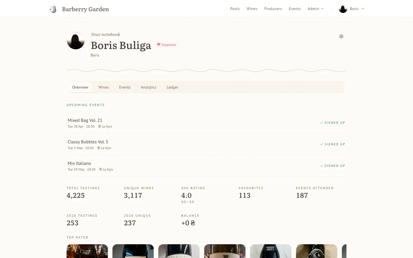
Your page is yours, full stop. Nobody else can see it - not other logged-in convives, not passing visitors. A 404 for anyone who isn't you. The only exception is me, and only because someone has to settle the ledgers; when I put on the admin hat I can see a version of a convive's page for that purpose and nothing more.
A couple of looser doors I'm turning over - neither decided, neither being built yet:
- Opt-in public notes and scores. Letting certain contributors opt into publishing specific ratings and tasting notes, the way mine are public now. A kind of co-authorship. The per-rating visibility flag is already there in the schema; the question is who, when, and what shape it takes socially.
- Semi-public pages. Letting you invite specific people - convives you drink with often - to see a slim version of your own page, without opening it up to the whole internet. A middle ground between private 404 and public to the world, for when the natural answer to "who should see this?" is a short list of names.
If either shape appeals to you, or you'd design it differently, tell me. Opinions are the currency here. The privacy section of the For contributors guide holds the longer version of this question.
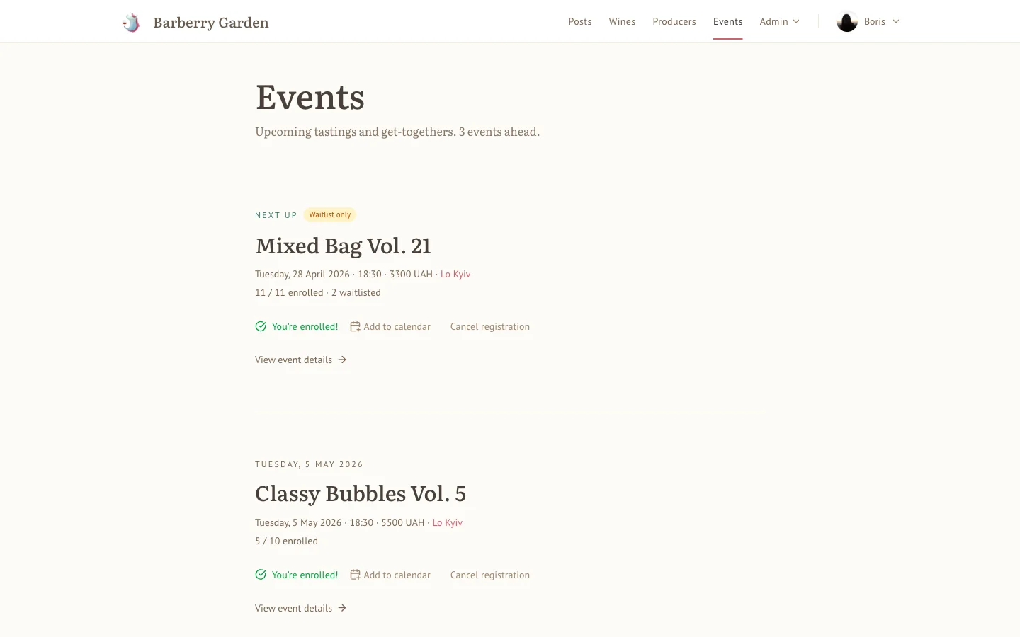
Events, Reborn
/calendar has been renamed to /events, which is what everyone was typing anyway. Old links redirect. The page itself has been flattened into an editorial list - the next event gets a headline treatment, everything else follows underneath in date order. Signup state (enrolled, waitlisted, fully booked) sits right on the card so you don't have to click in to find out.
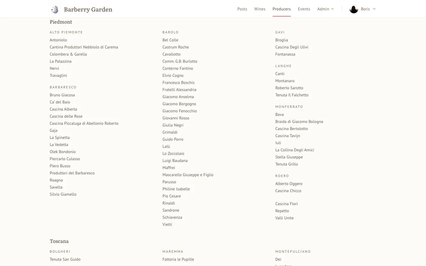
Producers, as a Newspaper
The producers page used to be a grid of cards and frankly, for a thousand winemakers, that was a lie. It's now an alphabetical, multi-column index grouped by country → region - more like the back of a proper wine book than an e-commerce catalogue. Jump links on each country. Search in the header. Click any producer for their page with description, country, region, and the wines we've had.
Maffrei and Mascarello sit on the same column in Piedmont because that's where they live. The list tells you that.
Your Own Notebook (If You Want One)
Disclaimer up front: this is the bit I've been quietly building for a few weeks and it's the feature I'm most interested in your opinion on. It's also not open to everyone yet. Both things are true. Keep reading.
What It Is
For years this site has shown you my wines, my notes, my cellar. Useful, I hope, but one-way. The plumbing is now there for you to have your own notebook under the same roof - same shell, same typography, same analytics - alongside mine rather than mixed in with them.
Concretely, if you're in, you can:
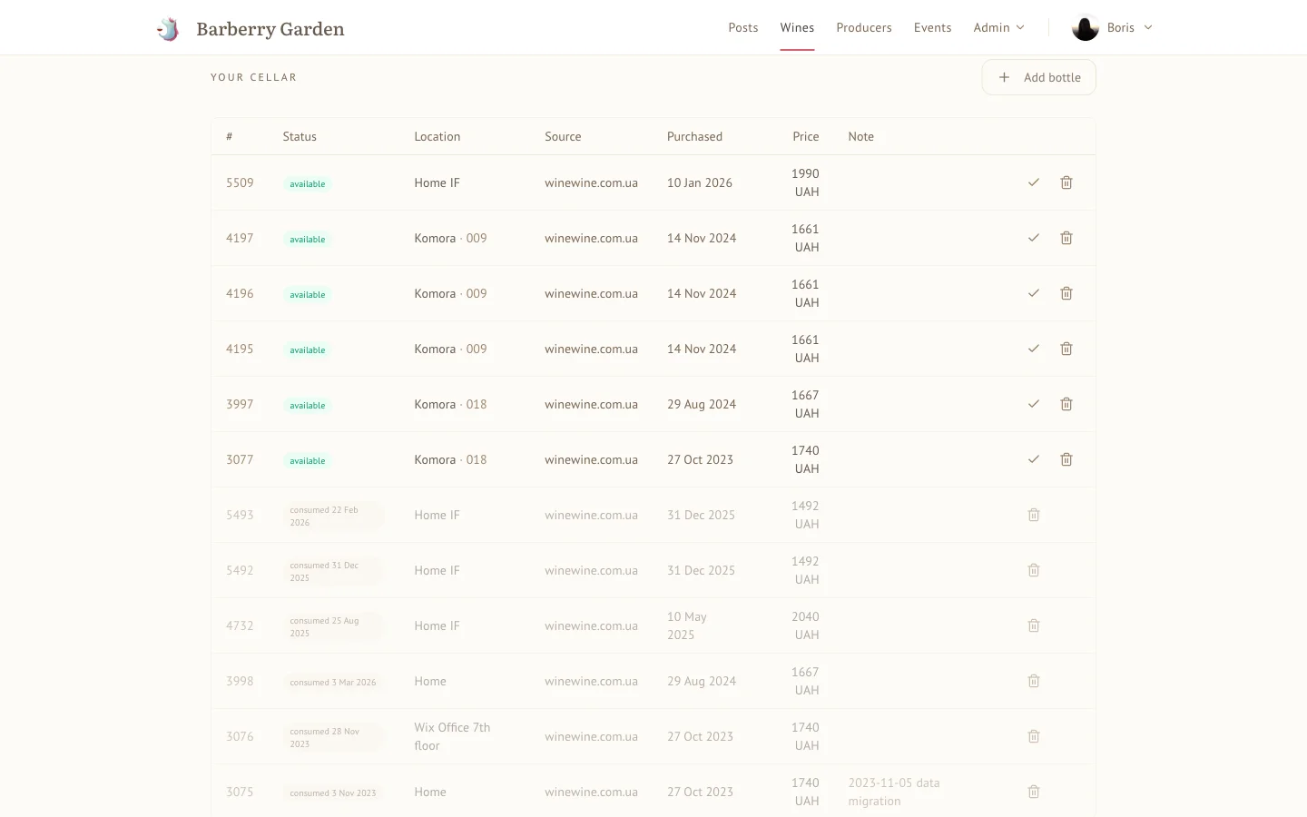
- Keep a real cellar, not a list of bottle names. Each bottle carries what you actually want to remember: what you paid for it, and where it physically lives. Location is two levels, not a single free-text scribble - a primary (e.g. "Home Cellar", "Kitchen rack", "Wine fridge") and a detail within it (e.g. "shelf 11"). Once that's in, the site knows how to find a bottle for you, group your inventory by location, and tell you what a given shelf is worth. Filter by origin, grape, producer, colour, sweetness, type, importer, price, location. Grid or table.
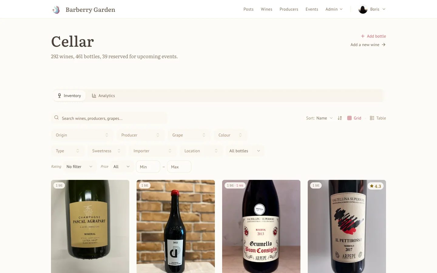
The same data shows up where you'd expect it to. Open any wine you own and there's a Your Cellar table right on the wine's page: every individual bottle you've got of it, with its status (available or consumed and when), its location, where you bought it, when, what you paid, and any private note you left on the bottle itself. Each row has its own little affordance to consume or bin. No separate inventory app to cross-reference - if you're thinking about drinking this, the numbers are already on the page.
-
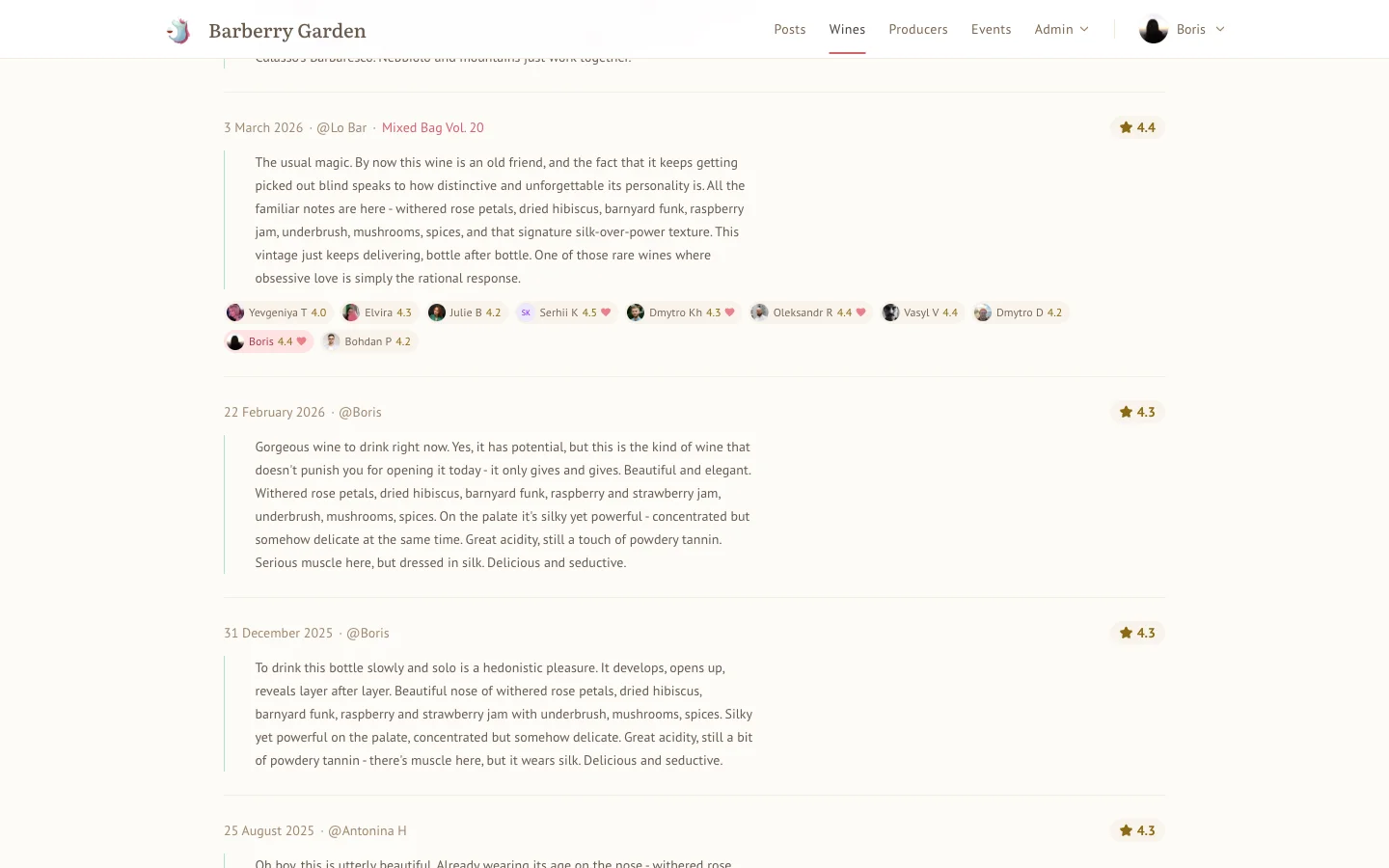
Consume a bottle the way you actually consume it. Opening a bottle is a small event - you click consume, write the tasting note, give it a score, stamp the date (and the venue and the event, if either applies), and the bottle is gone from your inventory but the memory of it isn't. The note lives on the wine's page next to all the other notes you've written about the same wine over the years. Three years of short, honest notes on a single Barbaresco is worth more than one long essay.
For now, your tasting notes are private - only you and I can see them. I'm still thinking about the product shape here: there's a per-rating public flag sitting under the surface, and in the future I'll probably let certain contributors opt into publishing their notes so everyone can read them the way you read mine. Not yet, though. I'd rather ship that once I've thought it through properly than half-ship it now.
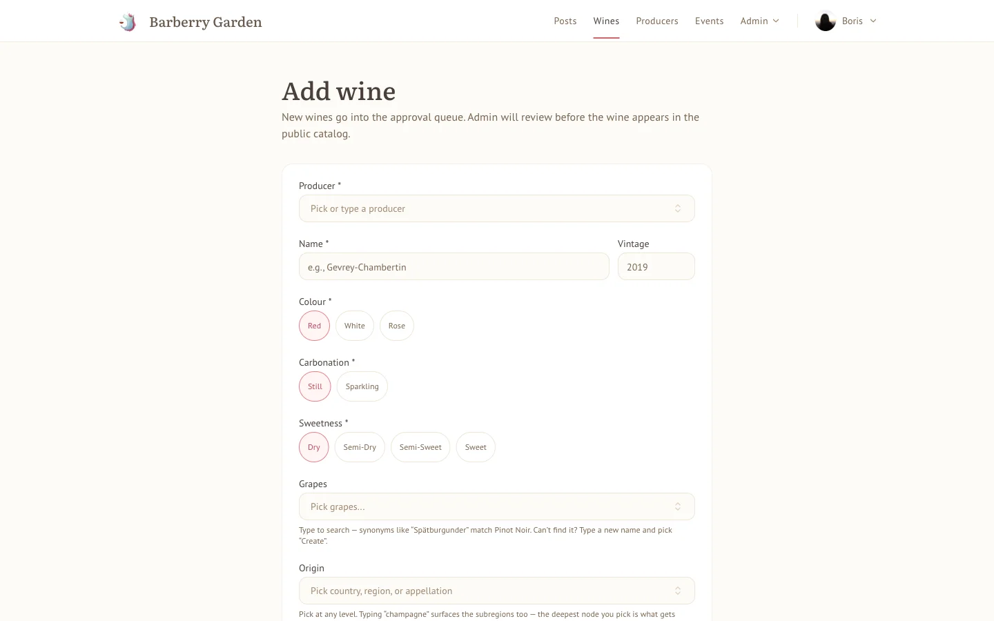
- Add wines the site doesn't know about. Catalogue entries: producer, name, vintage, colour, carbonation, sweetness, grapes (synonyms and all - type "Spätburgunder", get Pinot Noir), origin hierarchy, alcohol, volume. The whole metadata lot. New entries go through a light approval queue before they join the public catalogue, which mostly exists to stop the same Chardonnay being added eleven times with eleven different spellings.
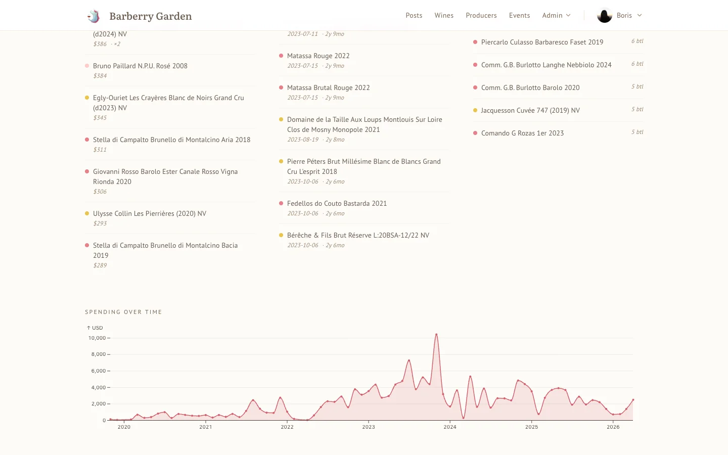
- Get the analytics back. This is the part I personally enjoy most. Because every bottle has a price and a location, the charts are real: spending over time in actual money, consumption by month, storage by location, countries and regions and grapes broken down into honest little bar charts, top values in the cellar, things that have been sitting there too long, things coming due. Not dashboards. Figures with a caption. The kind of view that makes you notice you've bought an absurd amount of Champagne this year and possibly should stop. Or, for god's sake, invite me to pop a few bottles already.
Everything lives under /profile - your overview, wines, events, analytics, ledger, cellar - the same shell I use. Same ⌘K search. Same keyboard shortcuts. No separate "my account" parallel universe.
There's more I've skipped here - reservations for upcoming events, batch adds, undo on accidental consumes, the way a producer page shows only wines you've touched, a dozen other small things. All of that belongs in a proper For contributors guide, and I'll write one (see below).
A Note On Nosiness
Technical honesty first: I run the database, which means - strictly speaking - I could peek at what's in your cellar. The rows are there and I'm the one with the admin key.
I don't. I've deliberately chosen not to build any admin tooling that reveals the contents of other people's cellars, specifically so I can't drift into the habit of looking. Part of it is obvious - your cellar is your cellar, same as your bookshelf or your bank statement. Part of it is self-interested: we drink together, and I want to be surprised when you pull something out of a bag. A cellar I've already snooped is a guessing game with an unfair advantage, not a blind tasting, and blind tastings are half the point.
Same discipline applies to tasting notes, private ratings, and anything else that should stay yours. I'd rather not build the back door than leave myself the temptation.
Why Not Open To Everyone
Two reasons. First, it's still rough in places - I'm the only person who's used it every day and the places where I've accidentally worked around a bug instead of fixing it are precisely the places a fresh pair of eyes would find in five minutes. Second, and more honestly: I want feedback before I scale it. What's confusing. What you'd expect to be possible that isn't. What's a five-line fix I haven't thought of.
So for now, it's invite-only. If you want in, tell me. The ask isn't money, it's opinions: use it, break it, write me one email a week about what's wrong with it. Early adopters get their names remembered and their feature requests weighed accordingly.
There's a proper For contributors guide now, sibling to the For readers one - cellar mechanics, ratings, visibility, what's private and what isn't, the lot. Start there if you're in. Start there before you're in, if you want to know what you'd be signing up for.
Posts Feel Like Posts
Posts gained a kind: event report, essay, interview, changelog. You'll see it in the eyebrow above the title. Hero images now behave (no more random squeezing of portrait covers, no duplicate hero showing up again in the body), the table of contents sits in the prose rather than floating in its own decorative frame, and body copy has a proper reading width so long posts don't stretch across the whole monitor like a terminal log.
Nothing revolutionary. Just a hundred small things that add up to "ah, this reads nicely".
What's Coming (A Teaser, Modestly Sized)
Two things are baking that I'm not ready to make public yet, but are real and working:
- Hosts. Trusted regulars will be able to run their own tastings on the site - create events, manage signups, settle up through their own ledger. It works. It's just not time yet.
- Rating in real time. The event report you currently see the morning after could, in the near future, be a live thing during the event itself - scores trickling in from everyone's phones, averages updating, wines revealing as you go. Bits of this are already running internally.
Expect both in the next volume. Possibly with a new feature I haven't thought of yet but will pretend I planned all along.
And there's a small shelf of internal changes - admin tooling, a tidier event-planning surface, better plumbing for in-flight event data - that you won't see directly but that are quietly making the rest of what's above work better. Mention it only so you know why the release notes look shorter than the effort.
The Honest Bit
Vol. 9 was about making the site do something. This one is about making it feel right to use. Less "look, it works", more "look, it breathes". The two volumes belong together - the first gave the site hands, this one gave it manners.
Try it. Press ⌘K a few times. Look up a producer you forgot the name of. Check your ledger. If you want in on the cellar, tell me. If something feels off, tell me that too - I'd rather hear it than not.
Santé 🥂
Found a bug? Have a brilliant idea? Want your own cellar? → feedback@barberry.io